
MoTown’s New Chalkboard Look
An Arty and Retro Menu Makeover at MoTown Desserts
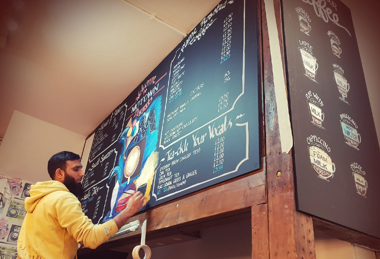
Some cafés have a vibe the second you walk in. MoTown Coffee & Desserts is one of those places. It’s the whole atmosphere, fun, lively, and a little bit retro. So when I got hired to refresh their menu boards, I knew this couldn’t be a basic “write it neatly and leave” job. The place is called MoTown, so the menu needed to feel like it belonged to the name, the 70’s retro theme… but still clear enough that customers could actually order without squinting.
If I’m honest, my happy place is painting on canvas in my own space, in my own time. But I’ve always liked a challenge, and projects like this are exactly how I up skill. Working on boards inside a busy shop, thinking about readability, speed, layout, and brand vibe, it’s a whole different skillset to studio painting. These opportunities don’t replace what I love, they add to it.
And I’m pretty sure this job came from that journey. My murals and design work at The Crepe Shop & Art Cafe got noticed, and MoTown’s owner wanted a touch of that same energy brought into his dessert shop. That’s the kind of recognition you don’t forget.
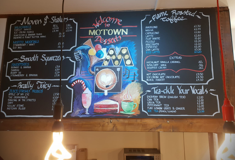
First, I tackled the layout. I wanted the board to feel organised, not chaotic, because when people are hungry they don’t want to decode a wall. So I designed the menu into clear sections and framed each category in a way that guides your eyes naturally: shakes and smoothies, juices, coffee, teas, extras. Everything grouped, spaced, and easy to scan.
Then came the fun part: bringing the Motown-inspired theme into it properly. I leaned into that retro music theme with playful lettering, stage-style frames, and a bold central artwork that ties it all together. The heart of the board is a retro music box, and sitting right on it is a round coffee cup with latte art, that’s also meant to feel like a vinyl record. Coffee and music in one image, like MoTown’s whole identity wrapped into a single visual.
Around that, I added the details that make it feel alive: the microphone, the music notes, and that big marquee-style “M” that gives the whole thing a “showtime” feel. The colours were just as important. MoTown already has a strong look inside the shop, including the cup designs on the wall, so I added lively pops of colour that complement the space instead of clashing with it.
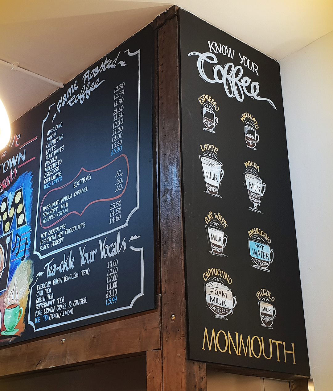
One of my favourite parts of this project is the “Know Your Coffee” board on the side. It’s basically a friendly cheat sheet that explains different coffee styles in a way that’s quick and visual. Some people love coffee but don’t want the awkward moment of asking what a macchiato is, or whether a latte is stronger than a cappuccino. This board makes it easy, and it fits the shop vibe perfectly.
The owner was really happy with the boards, he asked me to design the A-board too, to promote their featured coffee brand, Monmouth.
Huge thank you to the owner for trusting me with MoTown’s look and letting me bring that “Crepe Shop & Art Cafe” creative touch into a new space. This project was a perfect mix of design and personality: keeping it readable and functional, while giving it that Motown soul that matches the name and the vibe of the shop.